Good VS. Bad Round #2
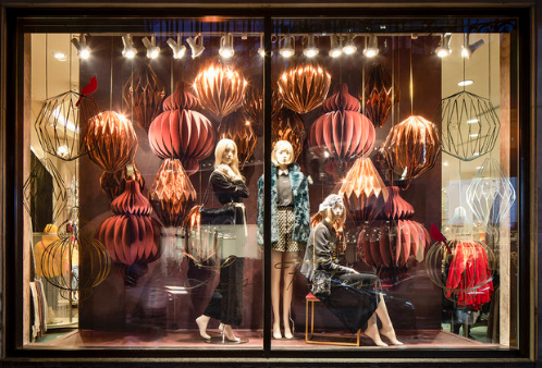
This is a beautiful and fancy window display. By looking at all the decorated elements, rose gold-based and the flower looks massive adornments, elegant texture, the unusual shape of the illustrations, and a nice proportion and direction successfully catch consumers’ attention to the center. Also, it sets a good rhythm with a fashion city scenario. Sometimes an elaborated background might take people’s eyes away from the products. However, the models have been emphasized in the middle by the accurate position the visual merchandisers have made. This kind of window display will bring different ages of female consumers included me!

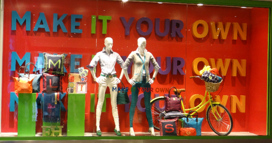
A bad example of a window display. As I mentioned in the last paragraph of the good window display, the usage of the colors, and the huge words of the background decrease people’s attention to the products. Let’s take closer about this window display, find color and texture, unpurpose line and direction, no particular shape, and there is no specific tension of this visual merchandising. The harmonized adornments lose their function of presenting products but making all the display to look like an off priced fashion brand. Even though it’s not an extremely awful window display, the company can still try to spend more time redesigning it not only improve the brand’s image but also might have potential consumers in the future.
This is the second visual merchandising analysis and hopes you guys enjoy it! Please leave a comment if you have further thought!