Good VS. Bad Round #4
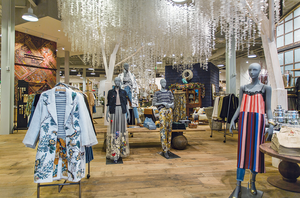
This is a good example of the in-store visual merchandising display. The principles of design rules including unity, harmony, rhythm, and surprise well represented the store with delightful and exotic colors and styles, the proportion between ornaments and mannequins were nicely arranged, the size of the products was elaborately considered, and the snow-like tree was intentionally added as tension, which is a merchandising strategy to create an unexpected image to consumers. when consumers enter the store, they will naturally be attracted and amazed by the first glance since everything in the store was thoughtfully replaced. Also, the lights advantageously fashioned the store!

For the bad example of the in-store visual merchandising display, I can see the efforts such as the lights, dressed mannequins, and sizable products were direction-followed in the wall, which the store was trying to put on but the whole display can be improved by replacing the round racks to another section of the store such as in front of the fitting room instead of the front of the entrance, and the out-fashioned products should be in a sequence that follows the nature color order of the rainbow. The store should also re-arrange all the sections and add some surprising decorations to increase potential consumers. Even though the type of design depends on the store’s strategies and chosen target market, the store can still enhance the brand image by utilizing the elements from core design tools and strategies.
This is the fourth visual merchandising analysis and hopes you guys enjoy it! Please leave a comment if you have further thought!
