Good VS. Bad Round #5
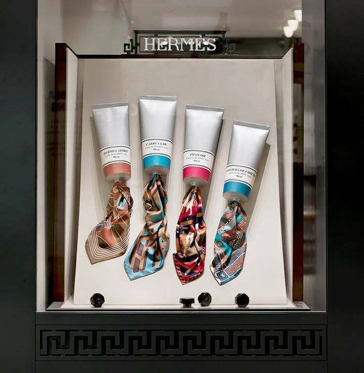
This is a good example of a window display of Hermes. The idea was simple but impressive by combining colorful scarves and fewer watercolors. For the usage of design elements and principles, the display utilized different color intensity to create a bright and melted -colored image, equal proportion between scarves and watercolors, huge but uninterrupted size of decorations, and the tension will be this unexpected image by achieving principles such as balance, harmony, repetition, emphasis, and surprise. I think the window display successfully coupled with both products and the idea since consumers’ attention would be in the scarves to see how beautiful they are. The watercolors well did its job to accentuate the key items!
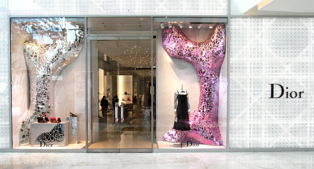
This is a bad example of a window display. I don’t understand what that two giant things were there for, and I also don’t think consumers would get the idea, because I in a fashion major also confused as others. The things way more huge to neither emphasize the products or impressed consumers. The display failed to achieve a nice proportion and size between themselves and the products, and the colors of both sides were weirdly arranged. Even though the decoration surprised consumers by its size, it seems to be a creative and good looking image for consumers.
This is the fifth visual merchandising analysis and hopes you guys enjoy it! Please leave a comment if you have further thought!
